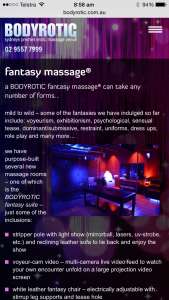
new mobile device website upgrade…
delivering the best possible experience to smart phones, iPads, tablets and other handheld devices
with the ever-increasing use of handheld devices we wanted our website to deliver the best possible experience on all platforms – so, we are proud to release our fully-upgraded, state-of-the-art website specifically enhanced to be responsive to handheld devices – the changes are aesthetically very subtle to the end user on most mainstream platforms, however you may notice a few more dramatic enhancements on some devices – having just completed our final testing, all of the new functionality is now live

- should you find any problems, something that doesn’t seem to work the way you think it should, or even the simplest typo; please let us know – we will address the problem as a matter of priority
- if there is anything else you’d like to see included in our mobile-responsive website let us know and we’ll see what we can do – all constructive feedback is warmly welcomed
we trust this new release is well received and, as always, if there are any further improvements you feel we can make, please let us know

